
Apps people use daily
The student timetable portal
A web page, on any device, with nothing to install and nothing to sign in to. Students never need an account — signing in exists only for staff who book rooms.
- No account, no install
- Every view has its own URL
- Calendar subscription
The address bar is the feature nobody expects
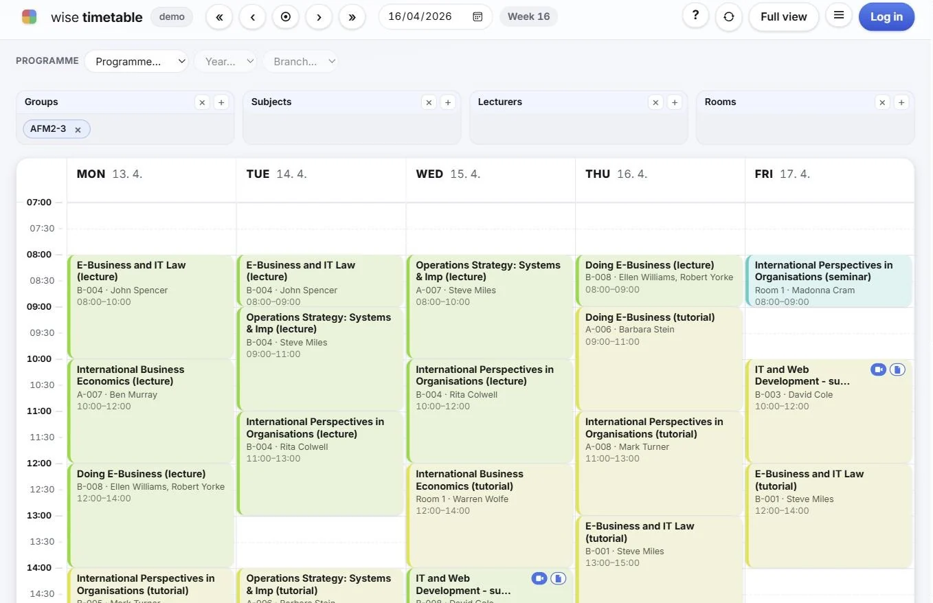
Everything a student chooses is written into the URL: the week, the groups picked, the language, and how much of the day is drawn.
So once the screen shows what they want, they bookmark it. That bookmark reopens exactly that view every time — and if they send it to somebody, it opens the same way for them.
This quietly removes an entire category of support question. A course representative can post one link that shows precisely the right filtered week, and a lecturer can bookmark the Monday-morning screen they check every week.
Finding your own timetable
The page opens deliberately empty, with Choose Groups above to see a timetable. A university timetable with nothing selected is every class of every programme at once, which is unreadable and slow to draw.
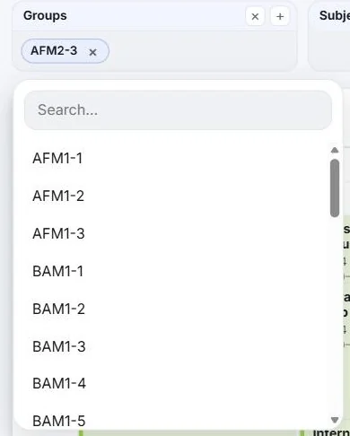
There are up to four panels — Groups, Subjects, Lecturers and Rooms. Most students only ever touch Groups: their study group is their timetable. Press +, type to narrow the list, tick what they need.
For a student who knows they are second year of a programme but not what their group is called, the Programme → Year → Branch row narrows it down. Some faculties also enable a Student ID box: type the student number and every group that student belongs to is selected automatically, including the ones they would never have guessed the name of.
Making a week readable on a small screen
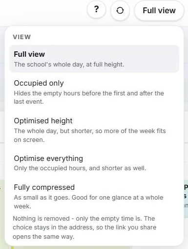
Five view modes, because a laptop, a phone and a printed sheet do not want the same thing.
Nothing is ever removed; only the empty time is. And because the choice lives in the address, a shared link opens the same way.
- Full view — the school's whole day, at full height
- Occupied only — hides the empty hours before the first and after the last event
- Optimised height — the whole day, shorter, so more of the week fits on screen
- Optimise everything — only the occupied hours, and shorter as well
- Fully compressed — as small as it goes, for one glance at a whole week
Details that a timetable office will recognise
- The clock down the left comes from your own bell schedule, so a faculty that starts at 07:00 gets a grid that starts at 07:00
- The coloured stripe on each card is your colour for that teaching type — taken from the same table the timetabling office uses in the desktop software
- Week numbers are shown alongside dates, because that is how universities refer to a week
- Closed days are shaded and labelled — public holidays, or days the office marked non-teaching
- Single arrows move a week, double arrows move a month, and the left and right arrow keys do the same
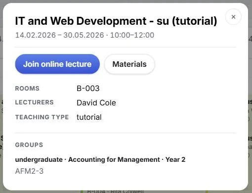
- Opening a class shows rooms, lecturers, teaching type, groups and the full date range — plus Join online lecture and Materials where the faculty has set them
Printing, language and calendar subscription
Printing produces a clean sheet rather than a screenshot of a web page. The interface language is switchable per visitor, not per installation.
And students can subscribe to their timetable from their own calendar application, so it stays correct in the place they already look. That is a live subscription, not a one-off export: a room change on Tuesday appears in their calendar on Tuesday. More on scheduled automation and ICS feeds.
See Wise Timetable on your own data
Book a 45-minute online presentation. We will walk through your institution's scheduling problem, show how Wise Timetable handles it, and answer anything your team wants to test.